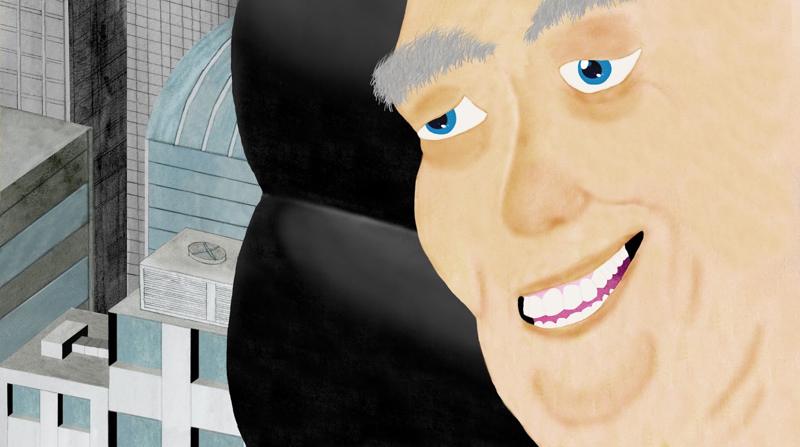
Combining Watts Atelier and Proko Drawing Practice

With a limited amount of time and a lot to learn, it's important to be strategic about drawing practice.

The last post provided specific ways to improve one's drawing quickly and correctly.

Here's some of my practice:

I start with the Watts Atelier drawing fundamentals warmup, freehand circles using a conte charcoal pencil on smooth newsprint:


After the circles, I do free hand ovals/ellipses:


After the ovals are straight lines and curved lines:


Next it's applying tone. This is a challenge because if the pencil doesn't have a good taper from the wood to the charcoal, it leaves streaks. Becoming proficient at this is definitely going to take some time:


That concludes the Watts warmup.

Here I've combined the Proko lesson of reducing bones into basic shapes with the Watts lessons of negative space and drawing through the forms. Hopefully by doing that I'm learning twice as much in half the time!


Are you working to improve your drawing? If so, how? Have you considered taking the Jazza approach? Post in the comments below. Thanks!

Improving Your Art Skills the Smart Way


I'm 47-years-old.

I'm past the halfway mark of my life. And there's still a TON of stories I want to tell!

Therefore,  I'm constantly looking for ways to improve my drawing skills quickly YET thoroughly.

After much reading combined with trial and error, I realized that I could neither focus solely on skills improvement nor solely on project creation without something suffering. It's essential that I do both simultaneously.

My revelation was confirmed when I saw this video by Jazza that breaks down how to improve one's art skills into three main areas—Innate Practice, Inspired Practice and Developmental Practice. I was thrilled when I realized I was almost already doing this method!

Here's the approach:
Innate Practice—practice that is inherent in what you’re doing. Though you may not be sitting down with the intention of improving oneself, you’re working at a level that’s comfortable for your abilities and over time, doing this in repetition, inevitably approves your abilities. This usually involves projects. Less about the intensity and more about the volume, repetition.

Inspired Practice—it’s the most fun, feels the most impactful. The heart of improvement comes from rapid bursts of learning from observation and enthusiasm. Burns bright and briefly so it’s hard to maintain over a long period. Although it may be the easiest way to motivate and push oneself, it’s the most difficult to start and maintain.

Developmental Practice—the easiest one to assign exercises to. Intentionally acquired skills and developmental progress. This is often the most frustrating and boring of the three types of practices. It’s constructive, mechanical but shows the improvement.

The ultimate form of practice is to combine all three of these methods.

For me it's:
Innate Practice—A Universe of Trouble web series. I'm painting, drawing and learning how to use about 8 different programs.

Inspired Practice—OK, I admit, I'm not actually doing this at this time. I discovered that with my fundamentals skills being weak, this type of practice was simply taking away from the time I could use to build my fundamentals.

Developmental Practice—Watts Atelier instruction and Proko human anatomy studies.

That's it, folks! As someone who's been following this plan, I can strongly recommend it. Check out Jazza's videos and see how they can help you improve your skills, too.

Gary Vaynerchuk's P.H.C.C.

I love this acronym:

P—Patience
H—Hustle
C—Content
C—Community

I've already embraced Patience and Content and am now focused on Hustle. Specifically, in order to get more form drawing into my day, I've switched from reading during my commute to drawing. I also keep a charcoal pencil on my desk and regularly practice holding it the Watts Way. Muscle memory!

I'll let Gary Vee explain the rest:


Using Video Reference

Since buying my first digital camera, I've relied on my own photo reference for drawing.

What I accidentally discovered while studying the bones is that video reference is just as good, if not better than photo reference.

Per Robert Beverly Hale's suggestion, and as I go through the Stan Prokopenko artistic anatomy curriculum, I'm drawing the bones from every angle in the hope of being able to draw them from memory.

When commuting to work, I've discovered that having a video on my phone of the bone rotating 360° allows me to pause at every angle and analyze the position for drawing. I can scrub back and force and get an accurate idea of how the bone's shape changes and the point of view changes. Here's a recent video I made of a scapula from which I draw while riding the bus:


Consider shooting or finding videos of the bones to help in understanding their intricacies.

Stock Video from Videohive


It wasn't until I started production on Episode 03 of "A Universe of Trouble" that I realized that I needed some serious help.

I had a scene in which a spaceship lands at a spaceport. And I had no idea how I could create that quickly and convincingly.

But I found the answer…

Videohive.net!

Part of the Envato Market site, it's a huge source of stock video.

It's where I found this landing spaceship which fit my scene perfectly (ship animation by SpaceStockFootage):


Since then, I've made it my only source for stock video. What I like most about the site is when creators include After Effects files with your purchase (there's nothing free on this site which is OK with me since the files are inexpensive. Besides, the quality of the work on this site deserves compensation.) This allows me to customize the video while also dissecting how it was created. If I can learn how someone else did something, I can do it myself next time and save some money!

The files are in HD, 1920 x 1080 and often have alpha channels for compositing. You can contact a creator for help or information regarding their files. Both single-use and multi-use licenses are available.

If you need a professional-grade piece of stock video, check out Videohive.net.

Making the Web Series—Toon Boom Animate Pro 3


Goodbye, my friend. You served me well!

I'm using NINE different programs to make the animated web series "A Universe of Trouble."

I counted.

And the main program of the nine is Toon Boom Animate Pro 3.

This program was discontinued this year and replaced with Toon Boom's Harmony program. This makes good business sense and is also good for the customer but…a few complaints.

First, I would have appreciated a formal notification from Toon Boom regarding them discontinuing my expensive software. I learned about it accidentally while searching for something. Needless to say…I was FREAKED OUT!

Second, it shows a surprising lack of foresight that Animate Pro and Harmony are incompatible! Yep, the only way for me to get my Animate Pro files converted to be opened in Harmony is to send Toon Boom the files. And there's a size limit for this conversion.

Not. Cool.


Hello, Gorgeous!

Having said that, I HAVE fallen in love with this program and I've only scratched the surface of what it can do. Since I'm in the middle of production, I'll use Animate Pro until completion; then I'll use Harmony going forward. This means possibly re-animating in Harmony the numerous "Adult Toy Story" scenes already completed in Animate Pro. Although time-consuming, it will be an excellent way to learn this powerful program. Learning while creating!

One of the many features I like about this program is the ease at which I can add effects. Transparencies/fades, blurs and other effects are easily applied and manipulated. Easy camera movement is another feature I like.

I've never used Flash but many animators, including Nick Cross, John K and Adam Philips have switched to Toon Boom from Flash. Harmony has also been used on tv and film projects from Film Roman, Disney and Dreamworks.

I also like their support. There's both a user forum full of helpful information and a highly responsive professional team to promptly answer your questions (just remember the company is based in Canada so be mindful of their holidays!)

PLUS their new subscription service makes a once pricey product much more affordable especially if you're a student. By having the option to pay monthly, you're only paying for what you use.

If you're interested in creating 2D animation that can include 3D elements, I strongly recommend using Toon Boom Harmony.


If You Can Draw a Form, You Can Draw EVERYTHING

As I mentioned before, FULLY grasping the basic yet essential idea of form—in contrast to knowing it but not fully getting it—has changed the way I draw.

Before I continue, let's distinguish form from shape. Per artist and instructor Marshall Vandruff, the simple difference is: a shape is flat; a form is thick. Here's how Andrew Loomis illustrates the difference in his "Fun With a Pencil" book:


Throughout all of my studying of accomplished artists, this same concept is stressed.

Pages from Glenn Vilppu's "The Drawing Manual":


A page from the original Famous Artists Course:


Screenshots from Stan Prokopenko's free Drawing Basics series:


From the Watts Atelier drawing course:


Clearly, the understanding of forms should NOT be overlooked. I'll be spending a lot of time drawing these basic forms and training my eye to reduce everything I see into those forms.

How Do You Memorize the Carpal Bones?

A Google search for names of the carpal bones yielded this helpful mnemonic from reference.com for remembering the bones's order (the right hand, radial side to ulnar side, proximal end to distal end):

Some Lovers Try Positions That They Can't Handle

S=scaphoid
L=lunate
T=triquetrum
P=pisiform
T=trapezium
T=trapezoid
C=capitate
H=hamate


I REALLY like this mnemonic device! Anything to help with the memorization of this information is great to me.

"A Universe of Trouble's" Mixed-Media Style


I'm intrigued by the difference between motivation vs. inspiration. Motivation is you grabbing something and seeing it to its end. Inspiration is allowing an idea to grab you and seeing it to its end.

My approach to "A Universe of Trouble" was INSPIRED. Despite the story being slightly dated and having a few shortcomings, I loved the idea of a person flying around the universe fixing hyperspace beacons. It was full of unexplored potential!

Once this story grabbed me, I realized that I wanted my adaptation to be visually distinct. 

First, the lead character was changed from a male to a black female. This choice was deliberate. I wanted to prove that, except for biographies, the ethnicity/race/gender of a character is irrelevant; what matters is the HUMANITY of the character.

Our unnamed leading lady of "A Universe of Trouble."

Second, I decided to do drawn animation. This may not be the market’s preference but it’s my preference and this project is a reflection of me and my sensibilities


Layouts for a scene.

Third, I decided to use painted watercolor that’s been digitally retouched instead of flat, digital color. Again, this is my personal aesthetic preference. I not only want this project to reflect my preferences but I want it to stand out in the market. I think these choices will help set my work apart.


Original painting (including some experimentation in painting the face.)

The final, digitally retouched version including some stock illustrations.

The look of the project has, however, evolved since I started it. Although I’m still using watercolor, I’m also using more stock images, stock illustration and stock 3D art. That choice was made to save time in having to create original art for every scene and episode. Using stock art also improved the overall look of the project.

Original 3D art purchased via CGTrader. Artist: Abhimanyu Kashyap.


Art with eye added from image below.


Lizard eye image used.


3D art purchased from CGTrader. Artist: Herminio Nieves @2014.


Stock illustration applied to final art below.


Use of stock illustration.

By using stock art, I unconsciously stumbled upon a more mixed-media look than I originally intended. But that’s OK! The beauty of doing a personal project is that despite having one thing in mind, you can end up discovering something completely unexpected that’s ultimately better than your original intentions.

Keep working, discovering, making choices and making mistakes! It’s the only way to progress.

I appreciate your feedback! If you like these posts, become a follower by clicking on the "Follow" button on the right. Thanks!


Learning Artistic Anatomy from Stan Prokopenko

Finding Stan Prokopenko's (Proko) tutorials and courses is one of the greatest drawing gifts I've experienced!

I was struggling to draw a head turned at different angles. When I did an internet search, his tutorial came up (the text and video versions are HERE.) I was amazed and thrilled at how simply yet effectively he explained this concept that had always eluded me.


A sample illustration from a Proko tutorial.

I've been a Proko disciple since.

I purchased his Figure Fundamentals course which was extremely insightful and helpful. I strongly recommend it.

Now I'm working on his Anatomy of the Human Body course (which covers the torso and back. I also pre-ordered the upcoming arms and legs courses. I'm PRAYING he applies his expertise to a head course, too. I could seriously use that!)

Unlike in the past when I rushed through books and tutorials, I'm taking my time with this course with the goal of dramatically improving my figure drawing by Spring, 2017. I intend to be done with Universe by then and want to return to the "Adult Toy Story" short.

BUT I can't complete that short until I have a solid grasp of human anatomy!

That's why I'm carefully studying the bones. I'm convinced, based on what instructors and skilled draftsmen have said, that understanding the skeleton is essential to drawing the human figure well.

Darren Foley on Becoming a Filmmaker

I came across this video at No Film School. It's a deeply informative meditation on the process of becoming a filmmaker by Darren Foley. I related to everything he was saying plus it reinforced how I feel and the path I'm currently on. Worth a watch for any creative person.


Meet the Composer—The Music of Bruce Edward Smith


I am deeply indebted to the numerous artists—musicians, 3D artists, illustrators, photographers—who create the work I am unable to and make it available for the rest of us to use.

It's important to me that I thank the artists whose work is playing an essential role in my "A Universe of Trouble" project. Gratitude, baby!

I often hear that a great story can overcome poor execution (and since my skills are, at this time, limited, I'm happy to hear this!) But I've often heard that a film project's SOUND MUST be good.

I already spent a significant amount of money on professional audio and music for two unfinished projects—"Adult Toy Story" and "Creation of a Non-Nation"—and can't justify spending more. So to balance the mediocre narration that I'm recording in my walk-in closet (seriously, I'm recording it in a closet. On an iPhone. This is DIY, right?) I'm using royalty-free music and sound effects.

The first choice is choosing a theme. I know I want something space/sci-fi-ish but not too over the top. I also know that I'll know it when I hear it. And once I heard Bruce Edward Smith's "Mystery Suspense Theme 1," at Pond5, I knew I had my theme!

"Mystery Suspense Theme" by Bruce Edward Smith. (Click image to hear preview.)

It's perfect! I especially love the way it starts off slow and foreboding, builds to a consistent theme then ends on another note of foreboding. This is exactly the feeling that I want to convey: foreboding about the experiences our repairwoman is about to have. It also works perfectly with how I imagined the credits and I use the theme throughout the episodes in the background.

This music is one of my favorite parts of this project. Thank you, Bruce Edward Smith!

Starting the Watts Atelier Drawing Course!

I'm starting my Watts Atelier Drawing Course!

The charcoal pencils and smooth newsprint (I've never used smooth newsprint before, only rough) arrived yesterday. I was so eager to start that I spent an obscene extra 50+ bucks to have them delivered in 2 days.

But it was worth it! Opening the boxes reminded me of being a kid on Christmas morning!

I'm now officially working towards my goal of quickly and thoroughly building a foundation of drawing fundamental skills.

I started at the beginning with the Fundamentals/Drawing Fundamentals Phase I section. After watching the Intro and Materials videos (helpful tips: only use single-edge razor blades for pencil sharpening; and buy them at a hardware store, not an art supplies store which has higher prices UNLESS you live in Brooklyn like me in which case the art supply store is cheaper than the local hardware store. Who knew?), I moved on to the Sharpening Your Pencil video.

Jeffrey Watts teaches a specific method of sharpening that involves scraping the wood of the pencil with one hand while rotating it with the other to create a smooth taper from wood to charcoal. Then more scraping to taper the charcoal and the option of finishing the charcoal taper with sand paper, the step I found to be essential to getting that nice taper.

My first try began like this:

Hmm…a bit chunky and rough. To be expected for a first try.


Eventually I got to this:

Improving.


Then finally to this:

Not bad for the first try. The next attempts will taper the wood into the charcoal better.


By the end of the evening, I had my proud collection:

Once you do one you do NOT want to stop!

This sharpening process is a bit addictive. I was late for work this morning because I wanted to do a couple more pencils!

It can be messy:

Blech!

I tried using cotton gloves but they interfered with my grip on the blade. Other issues: the fingers get stiff from gripping the blade and twirling the pencil but I think with time and enough doses of glucosamine sulfate and chondroitin sulfate in Hammer Nutrition's Tissue Rejuvenator, I should be all right.

Then there's the charcoal dust. I wear glasses and therefore convinced myself that the dust wasn't getting into my eyes despite some irritation. When I blew my nose, however, there were black specs so obviously I'm inhaling this stuff. I think I have a solution: I'll wear a mask and will pick up at the hardware store a pair of goggles in addition to the razor blades.

Beginning tools.

I can't express how excited I am to be on this journey of progress. Thanks for joining me in it!

And if you're enjoying these posts, please become a Follower by clicking the button on the right. Thanks, I appreciate it!

Meet the Story—The Repairman


I'm excited about making an animated/motion graphics adaptation of Harry Harrison's "The Repairman" called "A Universe of Trouble."

It's great that this story is in the public domain so those of us who want to take a terrific idea and explore it have material with which to work. You can download the pdf of "The Repairman" HERE.

This story fits perfectly into my overall goal: to tell stories my own damn self instead of hoping and wishing someone else tells them.


Some visual imaginings of "The Repairman."

With the exception of changing the Repairman from a man to a woman, I've left the story completely intact. My goal was to get the project out quickly as opposed to rewriting the story. Eventually, however, I will continue the story of our unnamed protagonist. There's a universe of trouble for this character to explore!

See the teaser trailer for Ep01 of "A Universe of Trouble" HERE.

Andrew Loomis's Flat Diagram/Map—Addendum 2

I dissected the diagrams at the top of page 31 of Andrew Loomis's "Figure Drawing for All It's Worth" in the first addendum HERE. Now we'll take a look at the bottom diagrams.


I like this diagram because it is one of the clearest examples Loomis has in this book showing how to determine the heights of multiple figures in one composition.

1. As always when drawing in perspective, first determine the horizon line/eye line.


2. For demonstration purposes, I'm going to use the background figure as the model for the remaining figures. Follow the steps in Addendum 1 to make the flat diagram/map.


3. Draw lines from the top of head and the bottom of the feet of the original figure to converging points on the horizon line. Then extend those lines to where you want the next figures to be placed. These guide lines will maintain the proportions of the various figures.


4. Based on the heights that you chose, draw the remaining figures using the Flat Diagram. Add the remaining guide lines for accuracy.


NOTE: The Flat Diagram boxes of the three foreground figures have vanishing points that extend off the page. 

Please tell me if this explanation was helpful to you or if there's anything you think I did wrong or is confusing. I appreciate your feedback!

AND if you DO like these posts, become a follower by clicking on the "Follow" button on the right. Thanks!