Starting the Watts Atelier Drawing Course!

I'm starting my Watts Atelier Drawing Course!

The charcoal pencils and smooth newsprint (I've never used smooth newsprint before, only rough) arrived yesterday. I was so eager to start that I spent an obscene extra 50+ bucks to have them delivered in 2 days.

But it was worth it! Opening the boxes reminded me of being a kid on Christmas morning!

I'm now officially working towards my goal of quickly and thoroughly building a foundation of drawing fundamental skills.

I started at the beginning with the Fundamentals/Drawing Fundamentals Phase I section. After watching the Intro and Materials videos (helpful tips: only use single-edge razor blades for pencil sharpening; and buy them at a hardware store, not an art supplies store which has higher prices UNLESS you live in Brooklyn like me in which case the art supply store is cheaper than the local hardware store. Who knew?), I moved on to the Sharpening Your Pencil video.

Jeffrey Watts teaches a specific method of sharpening that involves scraping the wood of the pencil with one hand while rotating it with the other to create a smooth taper from wood to charcoal. Then more scraping to taper the charcoal and the option of finishing the charcoal taper with sand paper, the step I found to be essential to getting that nice taper.

My first try began like this:

Hmm…a bit chunky and rough. To be expected for a first try.


Eventually I got to this:

Improving.


Then finally to this:

Not bad for the first try. The next attempts will taper the wood into the charcoal better.


By the end of the evening, I had my proud collection:

Once you do one you do NOT want to stop!

This sharpening process is a bit addictive. I was late for work this morning because I wanted to do a couple more pencils!

It can be messy:

Blech!

I tried using cotton gloves but they interfered with my grip on the blade. Other issues: the fingers get stiff from gripping the blade and twirling the pencil but I think with time and enough doses of glucosamine sulfate and chondroitin sulfate in Hammer Nutrition's Tissue Rejuvenator, I should be all right.

Then there's the charcoal dust. I wear glasses and therefore convinced myself that the dust wasn't getting into my eyes despite some irritation. When I blew my nose, however, there were black specs so obviously I'm inhaling this stuff. I think I have a solution: I'll wear a mask and will pick up at the hardware store a pair of goggles in addition to the razor blades.

Beginning tools.

I can't express how excited I am to be on this journey of progress. Thanks for joining me in it!

And if you're enjoying these posts, please become a Follower by clicking the button on the right. Thanks, I appreciate it!

Meet the Story—The Repairman


I'm excited about making an animated/motion graphics adaptation of Harry Harrison's "The Repairman" called "A Universe of Trouble."

It's great that this story is in the public domain so those of us who want to take a terrific idea and explore it have material with which to work. You can download the pdf of "The Repairman" HERE.

This story fits perfectly into my overall goal: to tell stories my own damn self instead of hoping and wishing someone else tells them.


Some visual imaginings of "The Repairman."

With the exception of changing the Repairman from a man to a woman, I've left the story completely intact. My goal was to get the project out quickly as opposed to rewriting the story. Eventually, however, I will continue the story of our unnamed protagonist. There's a universe of trouble for this character to explore!

See the teaser trailer for Ep01 of "A Universe of Trouble" HERE.

Andrew Loomis's Flat Diagram/Map—Addendum 2

I dissected the diagrams at the top of page 31 of Andrew Loomis's "Figure Drawing for All It's Worth" in the first addendum HERE. Now we'll take a look at the bottom diagrams.


I like this diagram because it is one of the clearest examples Loomis has in this book showing how to determine the heights of multiple figures in one composition.

1. As always when drawing in perspective, first determine the horizon line/eye line.


2. For demonstration purposes, I'm going to use the background figure as the model for the remaining figures. Follow the steps in Addendum 1 to make the flat diagram/map.


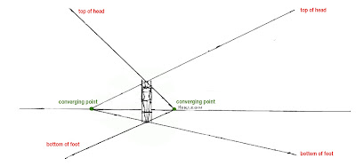
3. Draw lines from the top of head and the bottom of the feet of the original figure to converging points on the horizon line. Then extend those lines to where you want the next figures to be placed. These guide lines will maintain the proportions of the various figures.


4. Based on the heights that you chose, draw the remaining figures using the Flat Diagram. Add the remaining guide lines for accuracy.


NOTE: The Flat Diagram boxes of the three foreground figures have vanishing points that extend off the page. 

Please tell me if this explanation was helpful to you or if there's anything you think I did wrong or is confusing. I appreciate your feedback!

AND if you DO like these posts, become a follower by clicking on the "Follow" button on the right. Thanks!

Meet the Author—Harry Harrison

The official Harry Harrison website is maintained by Paul Tomlinson.


THIS is the official Harry Harrison website, author of "The Repairman," the story I adapted into "A Universe of Trouble."

Admittedly, I'd not heard of Harrison until I searched for a public domain story to adapt.

Based on how intrigued I was with "The Repairman," I will eventually read more of his work.

Harry Harrison

Studying with the Watts Atelier of the Arts


Although I understand I have to be patient as I build my drawing foundation, I also believe in hacking (NOT shortcuts!)

I’m currently doing Part 1 of the Stan Prokopenko Anatomy of the Human Body Course which focuses on the back and torso (Parts 2 and 3 are arms and legs.)

But what I also want to start learning now since it seems complicated is the head. Via email, I learned from Proko’s wife that he will be doing a head course but it seems that it will be some time before he gets to it (and when he does get to it, I’ll be sure to buy it.)

So I decided to hack the situation. If I can’t learn the head from Proko now, who can I learn it from? Where did Proko learn what he knows?

From the Watts Atelier of the Arts!

Thankfully, the Watts Atelier has online courses that include drawing fundamentals and…the head!

Although the head course doesn’t include anatomy, it does include instruction on the planes of the head, the part I find most difficult to understand.

Not only am I looking forward to getting formal training on this topic but since the planes of the head is my all-time most popular blog post, I’m also looking forward to sharing more in-depth knowledge about this topic.

Andrew Loomis—Arcs of Movement in Perspective Analysis II

Continuing a dissection of page 46 in Andrew Loomis's "Figure Drawing for All It's Worth"—

The Andrew Loomis—Arcs of Movement in Perspective Analysis I post ended with this image, a rough diagram of the figure before it moves:


THE FIGURE
So how did Loomis determine the positioning of the figure in this diagram?


It's based on these diagrams on page 33:


And specifically this part:


By applying the page 33 anatomical landmarks to the figure on page 46, you have a guide to positioning the various body parts in perspective. Keep in mind that the most of the body at the angle shown on page 46—torso, pelvis arms and legs—are cylinders. Remembering this will help you in conceptualizing the figure.

Of course, it's ideal to have some knowledge of anatomy to do these drawings correctly. That's why I said in the previous post that learning perspective and anatomy should come before learning to place a figure in perspective.

Please tell me if these explanations were helpful to you or if there's anything you think I did wrong or is confusing. I appreciate your feedback!

AND if you DO like these posts, become a follower by clicking on the "Follow" button on the right. Thanks!

Andrew Loomis—Arcs of Movement in Perspective Analysis I

Thank you to commenter Richard Matthew for asking about a diagram on page 46 in Andrew Loomis's "Figure Drawing for All It's Worth."

Page 46 from Andrew Loomis's "Figure Drawing for All It's Worth."

Before I attempt to answer Richard's question about the "snow angel" diagram, a reminder that I'm neither an expert nor experienced; I'm just sharing what I've learned or think I've figured out.

So here we go!

Richard's question regarding this page made me realize something about this book that I hadn't realized earlier: the order of the information in this book is illogical.

This page and the Flat Diagram pages deal with the FIGURE in PERSPECTIVE. Wouldn't it have been helpful, however, to have started the book with an explanation of perspective,  followed by an explanation of drawing the figure before teaching about the figure in perspective? So I think that the steps are out of order thereby causing confusion.

Therefore, to understand the snow angel diagram, we first need to understand its perspective and then place the figure into that perspective.

THE PERSPECTIVE
(NOTE: use a ruler to ensure that lines drawn to vanishing points are accurate. Some of my lines are freehand and therefore neither straight nor accurate.)

 1. As drawn by Loomis, the snow angel diagram is in 2-point perspective. One vanishing point is clearly shown below the text in the middle of the page. The second vanishing point, however, is WAY off the page to the right. I drew it by hand to make sure I found the right spot, taping two pieces of tracing paper together:

If you follow the horizontal lines of Loomis's diagram, they converge at a second vanishing point far off to the right.

2. To understand the arcs of movement, I thought it best to first draw the figure before it moved into that position, inside the 8-head-divided box explained earlier in the book. To make that box, I drew diagonals to find the midpoints of the box's left and right halves:


3. A line through both of those intersections to the second vanishing point divides the main box into quarters:

Line through midpoints goes to vanishing point on the right.

4. Lines to the first vanishing point create a new, centered box:

 
Vertical lines, centered, for placement of figure.

5. These newly drawn lines are the only ones with which I'm concerned right now:

This is the box to be divided into 8 heads to fit a standing figure.

6. Four boxes go below the middle line and four above. To determine their placement, again draw diagonals and use the intersections as midpoints:

 
Bottom section is halved.


7. Divide again to get the 4 bottom boxes in perspective…:


…to finally look like this, the first 4 boxes of our 8 box diagram:


8. Repeat the process to create the remaining 4 boxes:


The 8-head diagram in 2-point perspective.

9. Place the figure in proper perspective with the anatomical landmarks falling in the right boxes (please excuse my digitally mutated and inaccurate Loomis figure):

The standing figure from which we'll draw the figure with arcs.

Phew, that was exhausting! I'll continue tomorrow with the next steps of how to show the figure with the arcs, otherwise this post will be too long!

Andrew Loomis's Flat Diagram/Map—Addendum 1

Page 31 of Andrew Loomis's "Figure Drawing for All It's Worth" has some more helpful diagrams.

Oddly, the top diagrams on this page shows the finished drawing before the guide lines. It makes more sense to start with the last drawing and work your way to the finished drawing so that's how I'm going to show it (click on images to see them larger). Also,  it looks like Loomis drew the guide lines freehand but I recommend that you use a ruler for accuracy.


1. Start by establishing an horizon line (the eye line of the viewer).


2.  Choose a height for your figure with a vertical line, imagining that it extends from the top of the figure's head to the bottom of his feet.


3. Choose the depth of the perspective for the figure by drawing lines from the top and bottom of the height line to the same spot on the horizon, the vanishing point (shown here in red.)


4. Using Loomis's 8 heads proportion, divide the height line into 8 equal sections. To maintain accuracy in your divisions, it's important to make your divisions on the straight, vertical line since it is not in perspective and therefore not distorted (the lines are shown extended to the vanishing point.) Loomis added some additional lines: the blue line is for the shoulders; the green line is half the distance between the head and the bottom of the knees.


5. Draw another vertical indicating the width of the figure. For a male, Loomis uses a width of 2 1/3 heads (for a female, the width is 2 heads.)


6. Draw diagonals in the box to find the correct center in perspective (shown here in yellow.)


That's the completion of the "Quick Set up of the Map." Once you have this, you can place the figure in it using the landmarks on the body creating the "Quick Set up in Perspective."

After that, you can draw a fully-formed figure using the map as a guide.


Addendum 2 will explain the various figures in perspective that are at the bottom of this page.

If you like this post, please become a follower of my blog by clicking under the "You" section on the right. Thanks!

GO! Make Something Happen—Seth Godin


Image from Seth Godin's "Poke the Box: Workbook."
It's an easy concept but yet so hard for so many people to actually do: Start Now.

Per his bio page on his website: "Seth Godin is the author of 18 books that have been bestsellers around the world and have been translated into more than 35 languages. He writes about the post-industrial revolution, the way ideas spread, marketing, quitting, leadership and most of all, changing everything."

If you need convincing to do your thing no matter what, read Godin's "Poke the Box." It's a short, to-the-point manifesto that encourages all of us to pursue our potential regardless of our current life situations.

For those of us who want to see different stories with different people in them, we need to follow Godin's advice and START NOW in telling our own stories.

Meet the Characters of "A Universe of Trouble"—The Old Man

With nine months before I premiere the first episode of "A Universe of Trouble," it's a good time to start introducing the characters.

Harry Harrison's story that I'm adapting—"The Repairman"—has two human characters: The Old Man and The Repairman (or in the case of my version, Repairwoman.)

Meet The Old Man:

 
Music: Bruce Edward Smith
Sound effect: Andrew Thomson

Andrew Loomis's "Flat Diagram"—Part III

A huge "thank you" to commenter roxy rock!  She reminded me that I never completed this series of breaking down the diagrams in Andrew Loomis's "Figure Drawing for All It's Worth" with Part III.  So here it is!

First, a summary of Part I and Part II:

1. Loomis divided the standing male human figure into 8 horizontal divisions, each representing 1 head height; and a bisecting, vertical line (the standing female figure has slightly different proportions. See below for the pages showing the male and female proportions.) The width of the diagram is 2 1/3 heads wide. NOTE the vanishing point (on an invisible horizon line) that's highlighted in yellow.


2. The dashed lines extend from the standing diagram to the edges of a diagram that is in perspective. NOTE how all vertical lines extend to the vanishing point while the 8 head horizontal divisions are re-created in proper perspective.


3. By applying the standing diagram's anatomical divisions to the perspective diagram, the figure is correctly drawn in perspective.


4. This diagram is an alternative method of making a perspective diagram of the Flat Diagram. It's more of a freehand version of the first method while using the same anatomical divisions.


That's the summary of those sections of this page.

The final diagrams on this page involve applying the perspective drawing to a figure that's bending.

1. In this diagram, Loomis applies the Flat Diagram to the upright portion of the body. For the bending portion of the body—the portion that's in perspective—he uses the perspective diagrams that he explained on the rest of the page.


2. This diagram shows two bends of the body. By applying the Flat Diagram to the upright portions and the perspective diagram to the foreshortened parts, your figure will be accurately drawn. (I added the lines from the diagram to the vanishing point.)


I think the 3 keys to understanding this page are: 1) accurately create a male or female Flat Diagram with all of the proper anatomical divisions; 2) determine your horizon line and vanishing point and 3) project your vertical lines to your vanishing point. Once those 3 steps are down correctly, you just have to divide your diagram correctly using midlines, diagonals and intersecting lines.

Here are Loomis's proportions for the standing female and male figures. Note the differences:


That completes this series. I hope I explained this clearly. If you have any questions, additions or need more clarification, PLEASE post a comment below. And become a follower of this blog, too!

I'll continue to dissect this book and other Loomis books since they're all full of great drawing instruction.

Thanks!

Shortcuts vs. Hacking


Casey Neistat (l) and Gary Vaynerchuk (r).
I’m a fan Casey Neistat and especially Gary Vaynerchuk’s mature wisdom. Something that both of these optimistic and successful men talk about repeatedly is that there’s no shortcut to success. The “secret” to success is simple, actually: Hard. Work.

It’s that simplicity that I think bothers a lot of people. They want the road to success to be an easy formula that if someone would just share that secret with them, they’d be successful. They want something that can be implemented easily, like sending out ONE tweet or uploading ONE post. If success were that easy, wouldn’t everyone be successful?


There is, however, no formula. The only way to success is to work hard at the right things on a consistent basis. This is a lesson I’ve only recently learned and wish that I’d known it 20 years ago.

But wishing won’t get me back those 20 years of flailing, misdirection, dead ends and lack of progress. Instead, I’m focused on now and the future. And since I’m 20 years behind other artists in skills and knowledge, I need to acquire those skills and knowledge as quickly as possible if I’m to execute all of the ideas I have.

Therefore, what I do and how I do it is crucially important. Vaynerchuk and Neistat are often asked for secrets and shortcuts. That idea is a huge mistake, especially if you’re young. Your youth is the time to be patient, learn and experience so you can execute on the things you’ve learned when you get older.

I realize that there are no shortcuts to me becoming a better artist. There are, however, hacks I can use to improve my work quickly. To me there’s a big difference. A shortcut bypasses and skips. I already tried that and discovered that I missed a lot and had to go back and re-learn. A HUGE waste of time!


On the other hand, hacking is about efficiency. It’s about determining what the best in my field did to get where they are and to focus only on those things that will improve my skills quickly. I’ve studied John K, Leonardo Da Vinci, Stan Prokopenko, Marshall Vandruff and Aaron Blaise in an effort to distill what took them years to learn, focusing only on what works and not wasting time with that which doesn’t work. They’re willing to teach so I’m willing to sit at their feet and learn.

I look forward to discovering what works best in my course of study so I, too, can share it with those willing to learn. Because it’s NEVER too late to learn something new.