Recently a high school classmate contacted me asking if I'd design a logo for his church. Thankfully he said this was a paying job which brings me to a point.
With a few exceptions, I strongly believe that artists should ALWAYS charge for their work. If we don't charge for the work we do, the work is diminished. I can't tell you how many times I've been asked to do a lot of art work for no pay. In the past I accepted those jobs but those days are over.
ALWAYS CHARGE FOR YOUR WORK, EVEN IF IT'S A SMALL AMOUNT!
OK, rant over!
My friend gave me some ideas and information about his church and the goals they wanted to achieve with the logo.
I didn't tell him that I've NEVER designed a logo for a genuinely professional situation but hey, he didn't need to know that, right?
Since this was a relatively new experience, I did some research to ensure that I completed this job as professionally as possible.
First, I looked up logo design best practices. I got a lot of great and helpful hints on how to proceed.
Once I knew this, I researched church logos and my friend's church specifically.
That research turned out to be essential because I learned an important piece of info about the church that wasn't told to me until much later in the process.
By looking up the church online, I discovered that on its property is a meditation garden that contains a stone labyrinth.
Once I learned that, I knew that a labyrinth had to be one of the design ideas! I was especially excited about this because I wanted to stay away from the common church symbols (steeple, cross, bible) that other church logos had used.
So my first suggestion for making a logo is: do your research! Spend as much time on this step as you need. Because this is the step that's going to get you the ideas that you execute later.
Modified Mentler Pelvis Grids
In this previous post I explained how using the Michael Mentler pelvis grids got me close to a proportionally correct drawing but not completely correct.
By placing his grids over pictures of real pelvises, I could see where his grid was off and make adjustments.
Here's the result:
After doing all of this measuring, however, I realized how time-consuming it is. Also, these grids are only for front-neutral and profile positions. What would I do if the pelvis was in another position?
That's when I decided on another approach to learning the intricacies fo the pelvis: just draw them, male and female, every day from every angle until it's embedded in my memory. I discovered that my drawings work best if I start with the placement of the sacrum; then do the inlet; then the rest.
Yup, it's that simple. And Proko's premium account helps a lot by providing images of the male and female pelvises in almost every conceivable position in addition to an online 3D tool that allows one to position both pelvises in any way:
For me, this is the best way to learn and understand the pelvis. By doing lots of drawings in lost of positions, I'll develop a feel for the parts, proportions and the sex differences between the pelvises. Then when I place the pelvis in a figure or conjure one from imagination, it's structure will come to me instinctively.
I Ordered A Modbook!
Part of doing the Proko Anatomy of the Human Body for Artists curriculum involves using a tablet to digitally draw over images.
To do this, I'm currently using a Wacom Intuos Pen & Touch Small tablet and Adobe Photoshop. It's become frustrating, however, because I've never gotten used to my hand drawing in one place and me looking in another.
So when I discovered that there is a Mac-based tablet AND computer, I was excited! This is the ONE gadget I genuinely need—and want—more than anything else (OK, except a smartphone. I was REALLY excited when the smartphone came out and I didn't have to carry both a flip phone and a palm pilot.)
Why hadn't I heard of the Modbook before? It's been around since 2008 and is a brand of a pen-enabled Mac tablet computers. It's an aftermarket Mac conversion based on certain models of the Macbook and Macbook Pro product lines manufactured by Apple.
Despite having just purchased a new iMac, I decided that the Modbook is worth the price since it will allow me the tablet and portability I so miss with the iMac. It will also make doing storyboards and animation a lot easier than my current system.
As I often do, I impulsively purchased one! Here's what I ordered:
I was impressed that Modbook contacted me 2 1/2 weeks after the order was placed to inform me that a vendor issue was delaying the harddrive. As a result, I was upgraded from a 480GB harddrive to a 750GB. Now that's what I call customer service!
In my haste to order, however, I didn't notice that the Mac OS wasn't the most recent. In fact, it's several generations behind. And I didn't notice this until weeks after placing the order.
I sent a concerned email to Modbook and they got back to me promptly. They explained that my order's current delay is due to them working on getting the most current OS operating on the computer. I wrote them back to please take the time they need to get this right because the computer will be of little use to me without the most recent, or close to recent, OS.
As of this writing (Dec. 17) I still have not received my Modbook ordered on Oct. 13. This does NOT bother me. This computer could be exactly what I need and I'm willing to wait as long as necessary for it to be right.
When I do finally get my Modbook, I'll make an unboxing video. Keep a lookout for it!
Learning to Draw the Pelvis with Michael Mentler a.k.a. "The Bone Doctor"
As I explained in this previous post, doing the Proko "Bucket" method to find the bony landmarks of the pelvis wasn't working for me. I was struggling to get the correct shape of the top ellipse and without that shape correct, the rest of the drawing falls apart.
So instead of using The Bucket, I thought I'd just draw the pelvis based on observing my skeleton:
I liked the how the drawings were coming out but…I still felt like I was guessing about proportions and the locations of the parts. I felt like I wasn't fully understanding the pelvis.
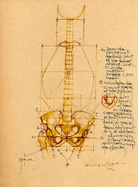
Out of frustration, I searched for other measuring methods for drawing the pelvis and surprisingly found only one: Michael Mentler's pelvis grids.
Mentler created a front/neutral position and a profile position grid, based on the head measurement, to draw the pelvis proportionally correct:
Hooray, another method! Just what I was looking for!
I deciphered Mentler's handwriting and did drawings based on his measurements:
His grids got me close to a correct drawing but they were off in some ways.
Then I decided to test the grid over a picture of a real pelvis instead of a drawing or my skeleton:
These drawings showed where the Mentler grid was off and how it could be improved.
In my next post, I'll show you the pelvis grids I developed based on the Mentler measurements.
Women in Animation Presents…Rich Johnson
On November 14, 2017, the School of Visual Arts hosted Women in Animation's presentation by Rich Johnson.
Johnson is a former Vice President of Book Trade Sales at DC Comics who has been credited with popularizing the graphic novel genre in mainstream bookstores and libraries. During his tenure, DC Comics had their first New York Times Bestseller with Neil Gaiman’s The Sandman: Endless Nights. He also co-founded and was Co-Publishing Director for Yen Press and co-founded the magazine Yen Plus.
Johnson is now the Vice President of Sales, Marketing and Business Development for Lion Forge Comics. He was the Co-Founder and Co-Publishing Director for Yen Press, the graphic novel and manga imprint for Hachette Book Group.Johnson gave an informative presentation about the history of the graphic novel. Here are my takeaways:
1. The only difference between a graphic novel and a comic is the binding. A comic is stapled (saddle stitched) and a graphic novel is perfect bound.
2. The first example of sequential art telling a single story is English artist William Hogarth's "A Harlot's Progress" from 1732. It's a series of six paintings and engravings that shows the story of a young woman, M. Hackabout, who arrives in London from the country and becomes a prostitute.
3. As a result of the unfavorable press following the 1954 United States Senate comic book hearings, comics publishers chose to self-censor. This explains why many 50's comics are goofy.
4. Neal Adams made comics more realistic in 1969 with his "Hard-Traveling Heroes" era of the team of Green Lantern and Green Arrow.
5. The father of the graphic memoir is Harvey Pekar.
6. Book stores sell more graphic novels than comic book stores.
7. Neil Gaiman's alternating between graphic novels and prose books contributed to the legitimacy of graphic novels.
8. The industry forgot that comics are for kids. The industry is now moving more toward teens.
JUST.
DO.
IT!
Johnson is a former Vice President of Book Trade Sales at DC Comics who has been credited with popularizing the graphic novel genre in mainstream bookstores and libraries. During his tenure, DC Comics had their first New York Times Bestseller with Neil Gaiman’s The Sandman: Endless Nights. He also co-founded and was Co-Publishing Director for Yen Press and co-founded the magazine Yen Plus.
Johnson is now the Vice President of Sales, Marketing and Business Development for Lion Forge Comics. He was the Co-Founder and Co-Publishing Director for Yen Press, the graphic novel and manga imprint for Hachette Book Group.Johnson gave an informative presentation about the history of the graphic novel. Here are my takeaways:
2. The first example of sequential art telling a single story is English artist William Hogarth's "A Harlot's Progress" from 1732. It's a series of six paintings and engravings that shows the story of a young woman, M. Hackabout, who arrives in London from the country and becomes a prostitute.
3. As a result of the unfavorable press following the 1954 United States Senate comic book hearings, comics publishers chose to self-censor. This explains why many 50's comics are goofy.
4. Neal Adams made comics more realistic in 1969 with his "Hard-Traveling Heroes" era of the team of Green Lantern and Green Arrow.
5. The father of the graphic memoir is Harvey Pekar.
6. Book stores sell more graphic novels than comic book stores.
7. Neil Gaiman's alternating between graphic novels and prose books contributed to the legitimacy of graphic novels.
8. The industry forgot that comics are for kids. The industry is now moving more toward teens.
JUST.
DO.
IT!
Challenges in Learning to Draw the Pelvis Using Proko's "The Bucket"
It’s been a bumpy road since this post from September about me struggling to understand the pelvis, spine and ribcage lessons in the Proko Anatomy of the Human Body for Artists course.
Soon after that post, I decided that I'd learn anatomy superficially to get through it faster and then return to it as needed to learn it more in-depth.
So I continued past my flimsy understanding of the pelvis, spine and ribcage and moved on to the good stuff—muscles!—and specifically to the pectorals.
BIG!
MISTAKE!
To reinforce what I'd learned about bones, I tried to them in my pectoral studies. But it became clear that I hadn’t learned much! I kept guessing where to put stuff. For every angle, I had no idea what to put where! Ugh!
It was clear that the “learn-the-basics-now-and-the-details-later” approach was NOT going to work.
The time to gain a firm grasp on this material and learn it in-depth is NOW.
So I took a step back and re-learned the bones.
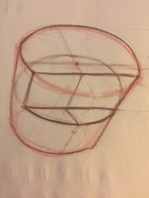
First I tried Proko's "The Bucket" method of drawing a simplified pelvis. Although it's an easy-to-remember system that gets your bony landmarks placed properly, I consistently had trouble getting the top ellipse drawn correctly. Without that right, the rest of the bucket doesn't work. Like these sad attempts:
I screamed, "There's got to be another way!" And a search online turned up only one other method.
I'll talk about this other pelvis-drawing method in my next post!
Animation Director Advice…And a Surprising Revelation
The Women in Animation (WIA) New York City chapter on Tuesday, October 10, hosted a sit-down with 4 animation directors at the School of Visual Arts.
From WIA:
Co-President Marge Dean (GM for Stoopid Buddy), Mark Osborne (Director of "The Little Prince" and more), Sarah Ball (Director of "Chuggington" and "Bob the Builder" and more) and Cecila Puglesi (Director of "Shift").
Our speakers will talk about how they became animation directors and about animation directing in general. Marge Dean will share with us the important work WIA is doing to realize a 50/50 gender balance in creative leadership positions within the animation industry by 2025. Inspiring you to become an animation director will certainly help in attaining this goal.Here's what I took away from the evening:
- It's important to make an animated short. It can open doors.
- It's more important to finish something than to spend endless amounts of time making it perfect.
- Say "yes" to things that you can't necessarily at that moment see where they will lead.
- Have patience and perseverance.
- Create your own opportunities.
- Most of American animation is either for kids or comedy.
- If an animated short is really funny and has a unique voice, the quality of the animation doesn't have to be high.
- The Powers That Be feel that good animation isn't funny.
It's this last point that shocked and disheartened me. I had always assumed that the low quality of tv animation was the result of a lack of craft and skills combined with the never-ending need to keep the budget low.
It never occurred to me that people believe that you can't have funny animation that looks good!
I'm not going to let this dissuade me from bringing to my ideas the highest quality I can create. It does, however, make me realize that if I want to pitch an artistically high quality show, it's necessary that I prove that it's economical.
Thank you to the panel for their insights and suggestions!
Old School vs. New School
The competition is huge. AND talented.
I’ll never draw as well as many other artists. I’ll never animate as well as many other animators.
So how do I stand out from the crowd?
I think I figured it out! I’m going to go “old school.”
It wasn’t hard coming to this decision. I’m Gen X. I’m from the generation that remembers Frank Sinatra and Elizabeth Taylor. My generation didn’t dismiss people like them. We knew they were old but we also had at least seen them when they were young. We didn’t dismiss outright everything that came before us even after we got a Walkman and an Atari.
I appreciate what came before me. And there’s a lot of great draftsmanship that came before me. I’ve always loved the 40s-60s style of cartooning. Lots of great, expressive, solid drawing. I also love the animation from that period especially the 40s Warner Bros. cartoons.
I’m not forcing myself to diverge from the drawing trends of today. I genuinely dislike what I’m seeing in tv animation and in web comics. I see little to no CRAFTSMANSHIP.
And that’s exactly how I plan to distinguish myself—as a craftsman.
I recently saw a tweet from an artist who said that learning perspective radically improved her art. My first thought was, “Yes, all artists should know perspective!” That’s a major reason Moebius’s work was so amazing.
So despite the huge number of people doing cartoons and animation, only a small fraction of those people have genuine skills. The reason people lack skills is because they don’t want to put in the effort to gain the skills. I’m not judging those people; I’ve been lazy and inconsistent regarding skills development. But I’m also not asking people to support my Kickstarter or Patreon with mediocre skills.
That’s my not-so-secret plan, folks! I’m going to distinguish myself with SKILLS. I don’t see any other way. So let’s keep developing our skills so we can stand out from the crowd!
And if you like these blog posts, please leave a question or comment or become a follower. I respond to ALL of your comments. Thanks!
See Drawing Skills Improve Quickly!
I’ve talked a lot about improving my drawing by focusing on one skill at a time. In my case, that’s anatomy.
Although I have since stopped, I did, however, have one exception to this rule: mechanical skills.
I came across the mechanical skills exercises in the Scott Robertson “How to Draw” book, a book I recommend adding to your drawing improvement library.
This book is of additional benefit because it includes QR codes and a password to access supplemental videos.
The book begins with what on the surface look like easy, pointless exercises.
Don’t be fooled! These exercises—much like drawing cubes, spheres and cylinders—are EXTREMELY important and useful. They’re essential foundation-building skills and they should not be skipped or ignored.
I regularly fit these mechanical skills into my daily routine:
- draw straight lines
- draw straight lines over a straight line. I got this and the drawing over curves idea from Irshad Karim. (Tip: keep your eyes slightly ahead of your hand to better direct it.)
- draw over a curved line
- draw a line through one point
- draw a line between two points
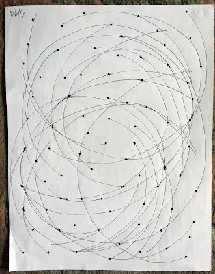
- draw curves through multiple points
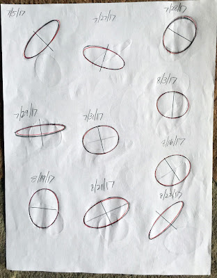
- draw ellipses:
- draw an ellipse then its minor axis
- draw a minor axis then an ellipse
- draw an ellipse in a box
- draw an ellipse between converging parallel lines
I’ve been practicing these faithfully with the knowledge that they will eventually be of use. I check my ellipse drawings with ellipse templates. The exercises's usefulness was revealed first when I watched a video of an artist drawing freehand straight lines—in ink!—for her comic book. People were amazed!
More importantly, I’ve been using my ellipse-drawing skills in my Proko anatomy drawing. In order to draw the bucket of the pelvis, one must be able to draw an accurate ellipse. That ellipse is the top plane of the bucket and its accuracy determines if the final bucket is correct.
So all of those seemingly mundane drawing drills ARE beneficial! I’ve created muscle memory and improved my eye-hand coordination. I’ve also noticed that with all of this drawing, I’m seeing mistakes sooner. I’m able to spot incorrect angles and shapes sooner than I did in the past which means I can get to the correct drawing sooner.
David Ogilvy said it best in “Ogilvy on Advertising” (1983) in regard to advertising but it also applies to drawing—"This willful refusal to learn the rudiments of the craft is all too common.” I’m not going to be that artist, the one who refuses to learn the basics. Because it’s knowledge and proficiency of the basics that allows one to stand out from the crowd.
I encourage you to get Robertson’s book and to spend some time on the mechanical drawing skills section. And check out Draw a Box for more helpful drawing drills.
And if you like these blog posts, please leave a question or comment or become a follower. I respond to ALL of your comments. Thanks!
Excellent Drawing Exercise—The Bargue Plates
I did it again.
In my endless desire to learn to draw EVERYTHING by TOMORROW (yikes!), I overloaded my daily practice. This time it was with a classic method I stumbled upon (I’m always stumbling upon something!) called the Bargue Plates.
I’m a big believer in “old school.” My thinking is, “Why reinvent the wheel?” Other people have figured out how to do this stuff so why not just learn from them and drastically reduce MY learning curve?
One of the skills I need to develop is improving my eye’s observations and the recording of those observations. Practicing the Bargue method seemed like a good way to learn.
Here’s some information from the Artists Network about the Bargue Plates:
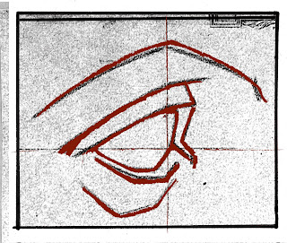
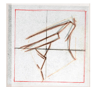
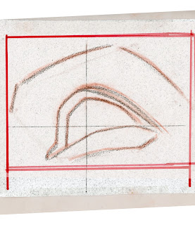
I thoroughly enjoyed doing these exercises and I think you will, too! You'll feel a strong sense of accomplishment when your lines match the originals. Instead of having a “friend” critique my drawings, I scanned them and checked them in Photoshop. The transparency of the original was decreased so I could clearly see the difference between it and my drawing when printed.
But…
They’re also taking time away from my anatomy studies. So I stopped for now BUT I will return to them eventually.If you’re looking to improve your observational and recording skills, I recommend drawing from the Bargue plates. Go here to download all of the plates that have been conveniently resized to letter, legal and tabloid sizes.
Give it a try and tell me what you think of this exercise!
And if you like these blog posts, please leave a comment or become a follower. I respond to ALL of your comments. Thanks!
In my endless desire to learn to draw EVERYTHING by TOMORROW (yikes!), I overloaded my daily practice. This time it was with a classic method I stumbled upon (I’m always stumbling upon something!) called the Bargue Plates.
I’m a big believer in “old school.” My thinking is, “Why reinvent the wheel?” Other people have figured out how to do this stuff so why not just learn from them and drastically reduce MY learning curve?
One of the skills I need to develop is improving my eye’s observations and the recording of those observations. Practicing the Bargue method seemed like a good way to learn.
Here’s some information from the Artists Network about the Bargue Plates:
This method, based on the teaching model developed by Charles Bargue, was widely used in the French Academy in the 19th and early-20th centuries, and centers around students copying instructional plates developed by the artist. The goal for the student is to improve his or her observational skills and learn to deconstruct complex visual information into large and small forms and shadows and light. Any artist can pursue the Bargue method on his or her own—all it takes is a set of reproductions, patience, and determination. Here are some tips for getting the most out of your self-directed Bargue exercises.
- Don’t get ahead of yourself, which will only lead to frustration. Start with a simple, high-contrast body part, and follow the steps in order. It won’t be long before you can tackle more challenging images.
- Remember that the whole idea with the Bargue exercises is to learn through repetition. Mistakes are part of the learning process and should never be interpreted as failure.
- While working on a drawing, use these helpful techniques to check your progress:
- Squint. Blurring your vision will help you gauge contrast between values.
- Turn the drawing upside down occasionally. This helps to provide a fresh perspective and allows you to see shapes more abstractly.
- Step away frequently to observe your drawing from a distance.
- Use a small “cut-out window” on a blank piece of paper to isolate areas and compare them to your copy.
- Have a friend critique your shapes.


I thoroughly enjoyed doing these exercises and I think you will, too! You'll feel a strong sense of accomplishment when your lines match the originals. Instead of having a “friend” critique my drawings, I scanned them and checked them in Photoshop. The transparency of the original was decreased so I could clearly see the difference between it and my drawing when printed.
But…
They’re also taking time away from my anatomy studies. So I stopped for now BUT I will return to them eventually.If you’re looking to improve your observational and recording skills, I recommend drawing from the Bargue plates. Go here to download all of the plates that have been conveniently resized to letter, legal and tabloid sizes.
Give it a try and tell me what you think of this exercise!
And if you like these blog posts, please leave a comment or become a follower. I respond to ALL of your comments. Thanks!
Subscribe to:
Comments (Atom)


